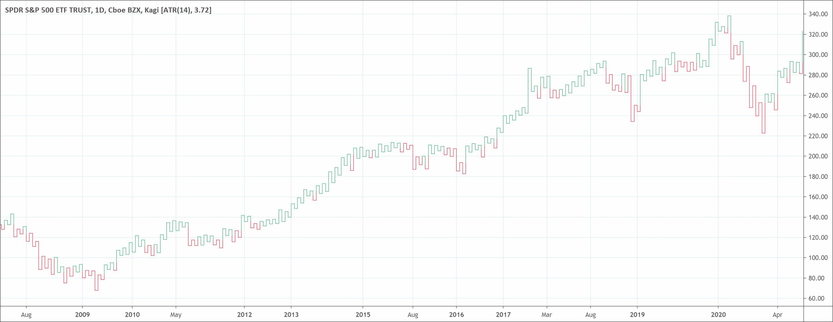
- Kagi chart is a kind of chart that tracks the price movements of a security.
- While price and time appear on traditional charts, with Kagi charts, only the price is important.
- A Kagi chart plots price like a snake, continuously. When the price falls, the line appears red color. And when the price rises, the Kagi line appears green in color.
- It changes color (from red to green and reverse) when trend changes.
The task of determining the short-term trend of any commodity can seem challenging. The daily price movements on a chart can seem choppy. They can also make it very hard to know which price movements are vital and will greatly affect the direction of security. Kagi chart helps traders understand the trend.
Luckily for investors, experts have come up with various charting and technical analysis techniques. These techniques try to filter out random noise and concentrate on the vital moves that drive the trend of an asset.
One method of filtering out this noise is the Kagi chart. Even though it is not the most common or widely used charting platform, it could be beneficial to your toolkit.
What is the Kagi chart type?
Kagi chart is a kind of chart that tracks the price movements of a commodity. Unlike other stock charts like the line, bar, or candlestick charts, the Kagi chart is unique. While price and time appear on traditional stock charts, with Kagi charts, only the price is important.
Due to this, the Kagi chart has only price, which appears on the y-axis. It doesn’t have time, which appears on the x-axis. By getting rid of the element of time, a Kagi chart gives a better picture of activities. It removes noise in the market, which is common to bar and candlestick charts.
A Kagi chart plots price like a snake, continuously. When the price falls, the line appears red color. And when the price rises, the Kagi line appears green in color.
Investors can use the Kagi chart because of the way it represents price, removes noise, and shows clear trends. In most cases, a Kagi chart is significant in technical analysis and among day investors or traders.
History
The Japanese are the creators of this specialized technical analysis tool. This invention happened in the 1870s. It uses various vertical lines to describe general levels of supply and demand for particular assets. Like the price movement of rice, a vital Japanese agricultural product.
Thick lines appear when the price of the underlying asset breaks higher than the previous high price. It can be a rise in demand for the commodity. Thin lines represent a rise in supply when the price falls lower than the previous low.
A key to understanding Kagi charts is to recognize the data that occur. As it is with Point & Figure charts, Kagi charts are strictly based on price action. Instead of having X and O Columns, Kagi charts are simply line charts that change direction when prices move by an amount.
How to read Kagi charts?
Kagi charts have vertical lines that reference the price action of an asset. They don’t anchor to time like other charts. The first thing that traders will notice is that the lines on a Kagi chart vary in thickness. This depends on the activity of the price of the asset.
At times, the lines are thin, and at other times, the lines will be bold and thick. The difference in thickness and direction is the most necessary part of a Kagi chart. This is because it is what traders use to create trading signals.
Types of lines in Kagi charts
There are five types of lines found within a Kagi chart types.
- Up Lines (Yang Lines) — happens during an uptrend
- Down Lines (Yin Lines) — comes up during a downtrend
- Projected Up Lines — appears on an intraday timeframe, a potential up line that would appear based on the current price
- Projected Down Lines — form on an intraday timeframe, a potential down line that would appear based on the current price
- Horizontal Lines — form when a line changes direction. When an up line changes to a down line, the horizontal line can be as a shoulder. When a down line becomes an up line, the horizontal line is the waist.
What does the Kagi chart tell traders?
While Kagi charts show time or dates on their x-axis, these are markers for the important price action dates. They are not part of a timescale. The y-axis on the right-hand side acts as the value scale.
The line in a Kagi initially moves vertically in the same direction as the price. It will continue to extend, as long as the price maintains the same direction.
When the price hits a set reversal amount, the line makes a u-turn and moves in the opposite direction. Therefore, each of the little horizontal lines on the chart show where a price reversal has occurred.
When a horizontal line joins a rising line with a plunging line it is a shoulder. A horizontal line connecting a plunging line with a rising line is a waist.
The difference in line color or thickness depends on the behavior of the price. When the price goes higher than a previous shoulder reversal, the line becomes thicker (green) and is a Yang line.
This can be a rise in demand over supply for the commodity and as a bullish upward trend. On the other hand, when the price breaks below a previous waist reversal, the line becomes thinner (red). This is a Yin line. This indicates a rise in supply over demand for the commodity and as a bearish downward price trend.
Investors use changes from thin (Yin) to thick (Yang) lines (and vice versa) as indicators. This information tells them when to purchase or sell an asset. A Yin to Yang shift means they should buy. A Yang to Yin shift means they should sell.
Advantages of using it
Right from the beginning, it is obvious that technical analysis can be a great fit for the Kagi chart. Support and resistance levels can appear on the Kagi chart. Traders can also look at trend lines that can come up when price breaches the trend.
Before looking at ways to trade using the Kagi, there’s one thing to consider. Kagi charts are not available on all trading platforms.
A trader can import a custom indicator that constructs Kagi charts. But they don’t have the default settings. Also, sometimes, they are not free.
Limitations of using it
Daily price fluctuations can make it very hard for traders and investors in the financial markets to determine the real trend of an asset. Luckily, methods like the Kagi charting have helped put an end to focusing on unnecessary price moves that don’t affect future momentum.
At first, a Kagi chart can appear like a confusing series of randomly placed lines. But the movement of each line depends on the price. Traders can use it to create very profitable trading signals.
The Kagi charting technique is not popular with mainstream active traders. But with its ability to identify the true trend of an asset, it wouldn’t be surprising to see a rise in the number of traders using it.
Differences between the Kagi chart and the Candlestick chart
There are a lot of variations between the Kagi and the candlestick chart. Some of the important differences are:
- A candlestick chart accounts for both time and price. A Kagi chart accounts only for price and does not consider time
- There are no settings with candlestick charts. But with a Kagi chart, the reversal price is a vital setting to make
- A Kagi chart shows only price movement. A Candlestick chart shows how price moved within a particular session.
- A candlestick chart shows the high and low prices. This is missing with the Kagi chart.

 Good Trading requires the Best Charting Tool!

 We loved Marwood Research’s course “Candlestick Analysis For Professional Traders“. Do you want to follow a great video course and deep dive into 26 candlestick patterns (and compare their success rates)? Then make sure to check this course!