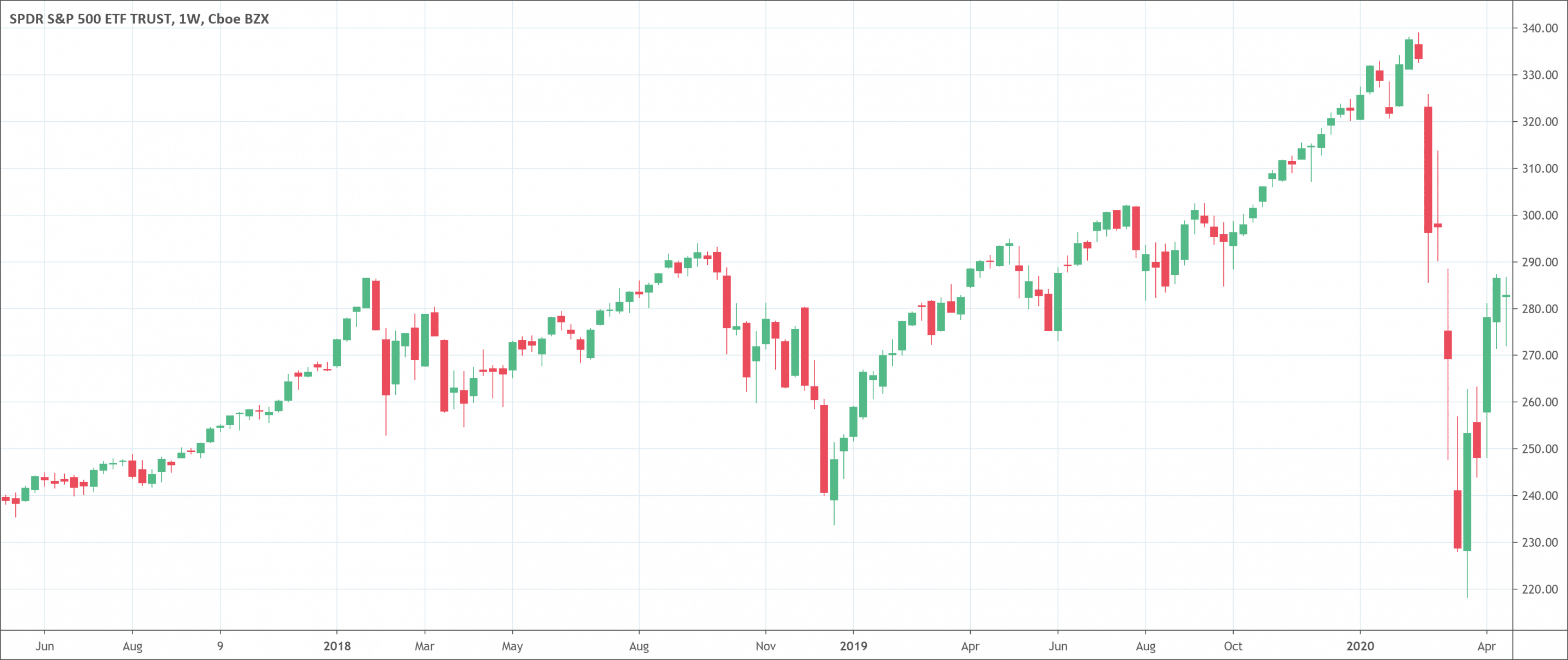
- Candlestick charts are very popular.
- It shows 4 prices for every fixed period:
- Open price
- Close price
- Highest price for the session
- Lowest price traded during the session
- Traders use the candlestick chart to determine where price is heading based on previous patterns.
What is a candlestick chart?
Simply put, a candlestick chart is a chart made up of individual candles, which investors use to understand price action. Candlestick price action has to do with pinpointing where the price opened and closed for that period. It also shows the price lows and highs for a particular time.
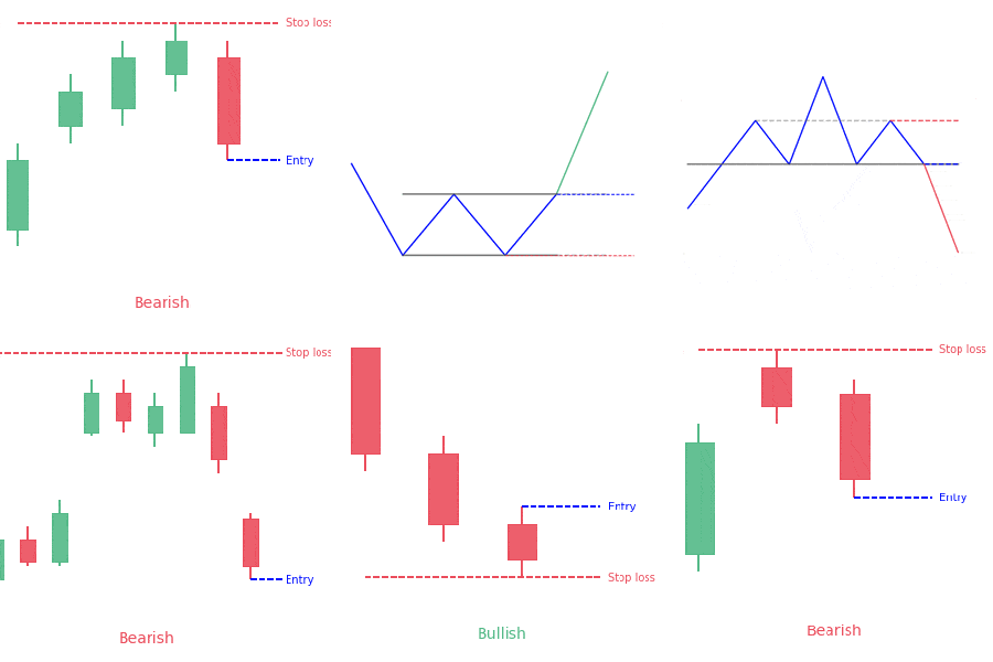
Price action can give investors of all financial markets ideas on trends and reversals. For instance, candlesticks can form charts that happen throughout forex charts that could mean reversals or trend continuations. Candlestick charts can also form individual formations which could mean buy or sell entries in the market.
History
They came up from Japan and most people believe that a rice trader called Munehisa Homma created them. It is very possible that they developed a lot after their initial use.
In the 1700s, the originator found out that while there was a connection between price, supply, and demand for rice. The markets were greatly influenced by traders’ emotions.
How to read any candlestick chart?
There are three particular points (open, close, and wicks) used in making a price candle. The first points to consider are the open and close prices of the candle. These points identify where the price of an asset starts and ends for a chosen time. They will make the body of a candle. Every candle shows a price movement for a particular time selected when looking at the chart. For daily charts, every candle will show the open, close, upper, and lower wicks of that day.
Open price
This shows the first price traded during the formation of the new candle. If the price begins to trend upwards the candle will turn green/blue (colors vary depending on chart settings). If the price declines the candle will turn red.
High price
The highest point of the upper wick shows the highest price traded during the time. If there is no upper wick or shadow, it means that the open or close price was the highest traded.
Low price
This can be the price at the bottom of the lower wick. But if there is no lower wick then the lowest price traded is the same as the open or close price in a bullish candle.
Close price
The close price is the final price that investors trade during the time of the candle formation. If the close price is lower than the open price, the candlestick will become red. If the close price is higher than the open price, the candlestick will be green or blue. This also depends on the chart settings.
The wick
The wick is also known as a shadow. These points are significant because they indicate the extremes in the price for a particular charting time. It is easy for traders to identify the wicks because they are visually thinner than the body of the candle. This is where the strength of candles becomes apparent. Candles can help investors keep an eye on the momentum of the market and away from the static of price extremes.
Direction
The color of the candle shows the direction of the price. If the price of the candlestick is closing higher than the opening price of the candlestick, the price is going upwards and the candle will be green or blue. A red candle will mean that the price closed lower than the open.
Range
The range is the difference between the highest and lowest price of a candle. Traders can calculate this by taking the price at the top of the upper wick and subtracting it from the price at the bottom of the lower wick.
Knowing this about a candle, and what the points show, means investors using candlestick charts have a clear advantage when it comes to distinguishing trend lines and price charts.
What does the candlestick chart tell traders?
Candlestick charts help traders know what happens in charts. They have up and down movements in the price. While these price movements can appear random sometimes, at other times, they form charts that investors use to analyze and trade markets.
Charts can either be bullish or bearish. Bullish charts show that the price will probably rise, while bearish charts show that the price will likely fall. No chart type works all the time, because candlestick charts show tendencies in price movement, not guarantees.
Candlestick charts represent emotion by visually showing the size of price movements with various colors. Traders use these charts to make trading decisions according to charts that occur regularly that help determine the short-term direction of the price.
Some traders find them more visually pleasing than standard bar charts. Also, price actions are easier to interpret.
Candlesticks are so named due to their rectangular shape and lines on either end that resembles a candle with wicks. Every candlestick represents the price data of a stock for one day. With time, the candlesticks group into easily recognizable charts. Traders can use these charts to make buying and selling decisions.
Candlestick charts are very popular because they are easy to read and show a lot of information about the actions of traders.
With candlesticks, you can see the opening and closing price, and the lowest and highest points an instrument attained.
Advantages of a candlestick chart
Look for support and resistance
Traders can make use of candlestick charts to look for levels of support and resistance. This is just the way they would with any other chart.
Have it in mind that you shouldn’t just look at the opening and closing price. You should also look at the wick because this will show the highest and lowest points and give you a clearer idea of levels of support and resistance.
Spot reversals in trends
This is probably the most significant thing you can do with candlestick chart types. If you trade trends, then candlesticks will be helpful to you. Candles having long wicks and small bodies may mean that the current trend is about to end and a new trend will start.
Limitations of using a candlestick chart
Investors will have to always wait for confirmation from the next candlestick. This will enable them to be sure that what the previous candlestick suggested will happen. Avoid trading based on one candlestick charts. Always look at it in the context of the market.
Difference between the Candlestick chart and a Bar chart
The shadows indicate the low and high prices of trading for that day. If the upper shadow on a down candle is short, it means that the open that day was close to the high of the day.
A short upper wick on an up day means that the close was close to the high. The link between the days open, high, low, and close determines the appearance of the daily candle. Real bodies can be short or long and black or white. Shadows can be long or short.
Candlestick charts and bar charts show the same data, just in a different way. Candlesticks are more visual, because of the color-coding of the price bars and thicker real bodies. These are better at showing the difference between the open and the close.
Conclusion
As Japanese rice traders found out many centuries ago, the emotions of traders surrounding the trading of an asset have a huge impact on the movement of an asset. The candlestick chart helps investors gauge the emotions surrounding assets, helping them make better predictions about where that stock might head to.

 Good Trading requires the Best Charting Tool!

 We loved Marwood Research’s course “Candlestick Analysis For Professional Traders“. Do you want to follow a great video course and deep dive into 26 candlestick patterns (and compare their success rates)? Then make sure to check this course!