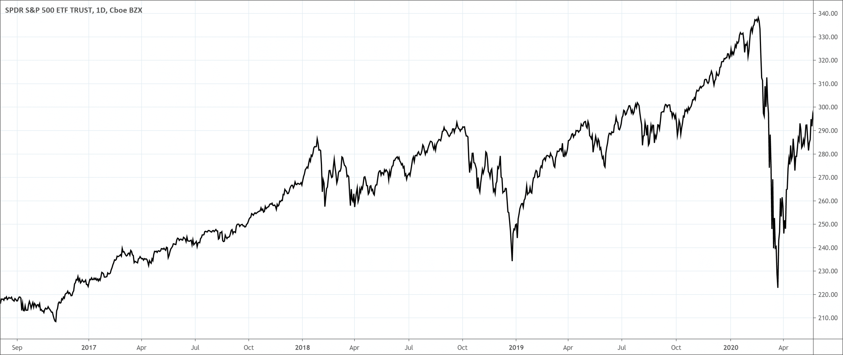
- A line chart is the simplest and most basic type of stock chart used to analyze financial markets.
- The line chart only plots the closing price of the underlying security.
- It has a line connecting the dots created by the close price.
A line chart is the simplest and most basic type of stock chart used to analyze financial markets. The line chart is also known as a close-only chart because it plots the closing price of the underlying security. It has a line connecting the dots created by the close price.
In this chart, a graph can show the price data for the underlying security. On the graph, the time is from left to right along the horizontal axis (x-axis). And the price levels are from the bottom up along the vertical axis (y-axis).
Usually, the price data used in line charts is the close price of the underlying commodity. The uncluttered simplicity of the line chart is its greatest strength. This is because it offers a clean, easily recognizable, display of the price movement. This makes it a great tool for identifying the dominant support and resistance levels, trend lines, and some charts.
However, the line chart doesn’t show lows and highs, therefore, they don’t show price range for the session. Despite this, Charles Dow had a high preference for them. He was only interested in the level at which the price closed. He felt that this was the important price data because it determined the unrealized profit or loss of that period.
What is the Line chart?
A line chart is a graphical representation of the historical price action of an asset. This price action connects various data points with a continuous line. This is the most basic type of chart used in finance and typically only shows the closing prices of a security over time. Line charts can be in any timeframe, but mostly use day-to-day price variations.
It makes use of points linked by line segments from left to right to show changes in value. The horizontal axis shows a continuous progression, often of time. The vertical axis shows values for a metric of interest across that progression.
There is no high or low point specified, candlestick, and bar charts. They are rather based on lines drawn directly between closing prices. This chart type is commonly used in reports and presentations to show general price movements. But they mostly don’t have granular information when compared to other charts.
Traders apply the line chart when they want to emphasize changes in values for one variable. There is no high or low point specified, unlike candlestick and bar charts. They are rather based on lines drawn directly between closing prices.
This chart type is commonly used in presentations and reports to show general price movements. However, they often don’t have granular information when compared to other trading chart options.
How to read the Line chart?
On the horizontal axis, a variable shows continuous values that have a regular interval of measurement. This variable is commonly a temporal one, creating an observation each minute, hour, day, week, or month.
The choice of interval size, or bin, is a decision that the trader will usually need to make for the data. It is not an inherent data characteristic.
On the vertical axis, there will be a second numeric variable for points that fall in each of the intervals characterized by the variable of the horizontal-axis. In most cases, this will be a statistical summary like a total or average value across events within each bin.
Traders can also plot various lines in a single line chart to compare the trend between series. It is common to observe the breakdown of the data across multiple subgroups. The ability to plot many lines also gives the line chart a special use case where. Traders may not usually select it.
Normally, a trader can make use of a histogram to show the frequency distribution of a single numeric variable. But it is tricky to plot two histograms on the same axes. The line chart, therefore, serves as a good mode of comparison as a substitute. Line charts used to show frequency distributions are often referred to as frequency polygons.
What does the Line chart tell traders?
Line charts give investors a good visualization of where the price of a security has moved over a particular time. Since line charts only show closing prices, they lower noise from less critical times in the trading day.
Since closing prices are significant, it is understandable to see why line charts are popular with traders. Traders can apply line charts with other charts to view the full technical picture.
To use a line chart, information needs to be in a table with two or more columns. Data in the first column show positions for points on the horizontal axis for each line that traders will have to plot. Every following column shows the vertical position for points of a single line.
Some tools make line charts from a different data format where three columns should appear. They do this regardless of the number of lines to plot. In these instances, the columns specify the vertical values, horizontal values, and which line each row will come up.
Selecting a measurement interval
A vital part of making a line chart is choosing the proper interval or bin size. For temporal data, a broad measurement interval may mean that it takes too long to see the direction of the trend. On the other hand, a short measurement interval may only reveal noise and not any signal.
Testing various intervals or depending on domain knowledge about the data recorded can inform traders of a good bin size choice. It can also be possible to use various lines. One line with be for an interval, and a second line for the general trend, averaging over a rolling window.
Avoid playing too many lines
With great power comes great duty! Therefore, while there is the technical capacity to put various lines in one line chart, be judicious in how many data you plot.
A good idea will be to limit yourself to five or less lines. Otherwise, the plot ends up resembling an unreadable tangle. But if the lines are properly separated, traders can still plot all of the values they wish to track.
If there’s a need to plot more lines than traders can read in one axis, consider fitting the plots into a smaller line chart. It harder to see details in these plots, therefore, it is a good idea to sort them by some vital characteristics. You can use qualities such as average or final value to help draw vital points.
Advantages of Using Line Charts
Clarity
Traders can get overwhelmed with a lot of data when analyzing a chart. Using charts that show various price data can give various signals that can be confusing. Using a line chart helps traders detect vital resistance and resistance levels.
Ease of use
Line charts are ideal for beginner investors because they are simple. They assist in teaching basic chart reading skills before learning more advanced techniques. Volume and moving averages can work in a line chart as investors continue their learning journey.
Limitations of using Line charts
They may not offer enough price data for some traders to monitor their trading techniques. Some techniques require prices gotten from the open, high, and low.
For instance, a trader may purchase a commodity if it ends above the high price of the previous week. Candlestick charts, which have the daily open, close, high, and low prices, may be more vital in these cases.

 Good Trading requires the Best Charting Tool!

 We loved Marwood Research’s course “Candlestick Analysis For Professional Traders“. Do you want to follow a great video course and deep dive into 26 candlestick patterns (and compare their success rates)? Then make sure to check this course!