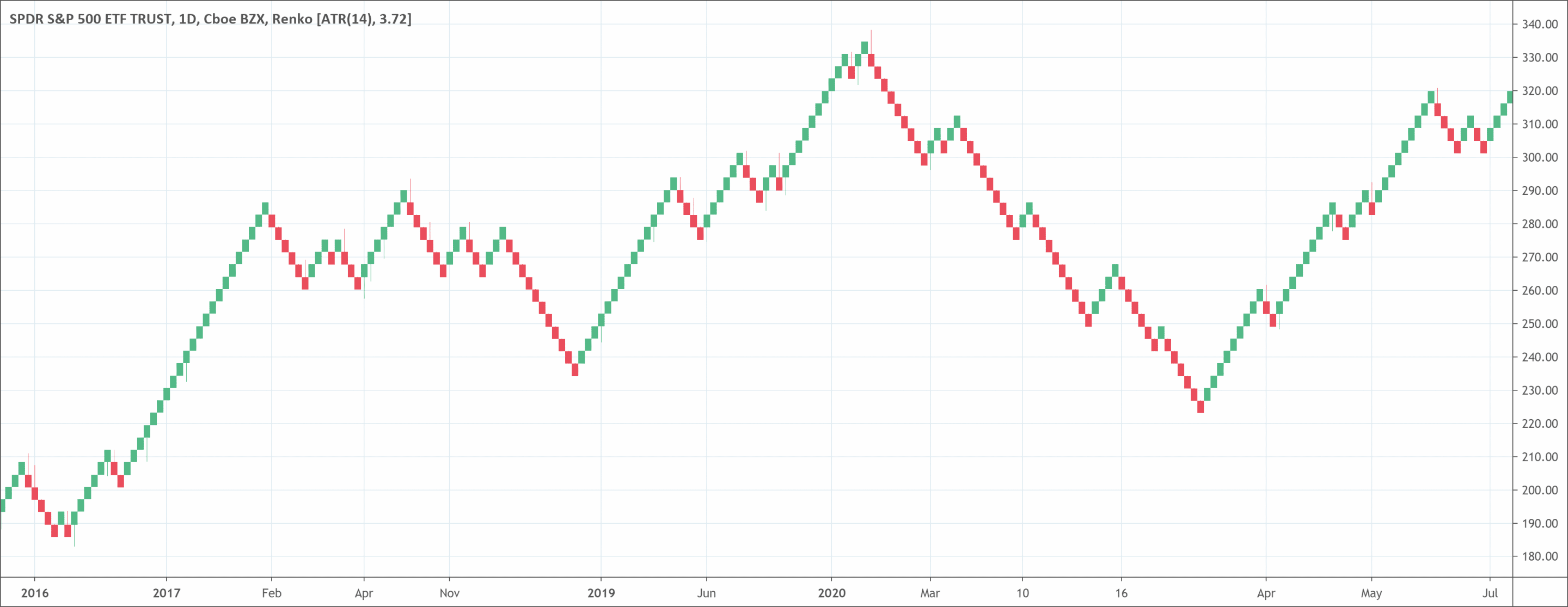
Charts are important in forex trading. It is possible to effectively trade forex today without using a chart. One of the most popular forex charting styles is the Japanese chart, Renko.
Renko charts are great in analyzing the market from a completely different point of view. If you intend to view raw price action, then this chart will be worth your time.
- A Renko chart is a chart that uses vertical boxes.
- The boxes are arranged so that they are not next to each other, but instead are placed at 45 degree angles to each other.
- The boxes can be any size. For example, the boxes can be $0.10, $0.50, $5, or $10. The size of the box is called the ‘box size’.
- The chart has a time axis. The time axis is used to show the time when the vertical bars were created. The time axis is not used to show when the price changed, because the vertical boxes do not change when the price changes.
- The vertical bars only change when there is a price movement of more than the box size. If there is no price movement of more than the box size then nothing happens to that vertical bar on that price bar.
- The vertical bars are also called ‘bricks’.
- Renko charts filter most price movements to make it easier for traders to focus on trends.
What is the Renko?
Most people believe that the Renko chart gets its name from the Japanese word for bricks, “Renga”. This is because it resembles a series of bricks. A new brick forms when the price moves a certain price amount. Also, traders can place each block at a 45-degree angle (up or down) to the previous brick.
Typically, an up brick is has a white or green color while a down brick is has a black or red color. A Renko chart displays price movements in financial markets. Blocks or bricks make up the chart. The blocks have the same size. The blocks can either be bearish or bullish, just as it is in a candlestick chart.
Renko charts have individual blocks of the same size because the chart doesn’t consider time. The Renko chart has a setting parameter, which specifies which pips traders will consider for for each brick.
How to read the Renko chart?
Traders can identify Renko charts based on various parameters, such as their types and colors.
Types of Renko charts
There are two types of Renko charts based on the calculation used. These are high/low charts and open/close charts.
High/Low Renko Chart
This type of Renko chart takes into consideration each price action behavior. As the name suggests, it consists of price action between the lowest and the highest point on the chart.
Open/Close Renko Charts
This Renko style takes into consideration only the price moves which found within the Open/Close range of the price action.
The colour of Renko charts
Change of color is another way of identifying Renko bricks and how you might trade with them. You will notice a change in brick color, which strongly indicates a change in price direction.
Therefore, if there’s a green brick and then a red brick, the price didn’t just move 10 points to form the red brick. Price had to move 10 ticks from the green Brick and then a further 10 ticks to complete a red Renko brick.
A wick on a Renko chart means that the price tried moving in the opposite direction but failed. The wick shows the length of the movement of price in the rejection.
What does the Renko chart type tell traders?
Renko charts filter most price movements to make it easier for traders to focus on vital trends. Even though this makes trends much easier to detect, the downside is that traders lose some price information. This is a result of the simple brick construction of Renko charts.
The first step in constructing a Renko chart is choosing a box size that shows the level of price movement.
For instance, a stock may have a $0.50 box size or a currency may have a 100 pip box size. A Renko chart is then created by putting a brick in the next column once the price has passed the bottom or top of the initial brick by the box size.
For stocks, assume it is trading at $20 and has a $0.50 box size. If the price moves up to $20.50, a new brick will form. That brick will only form once the price closes at $20.50 or higher. If the price only gets to $20.49, a new brick will not form. Once a brick forms, traders will be unable to delete it. If the price gets to $25.00 or higher, another brick will form.
Renko bricks are not created beside each other. So, if the stock drops back to $20.50, a down brick will not come up close to the previous up box. The price would have to drop to $20 for a down brick to come up below the previous up brick.
Although a fixed box size is common, traders can also use ATR. ATR is a measure of volatility, so, it fluctuates with time. Renko charts based on ATR will use the fluctuating ATR value as the box size.
Advantages of using the Renko chart
Renkos display a time axis, but the time intervals are not constant. It might take one brick months to come up, while other bricks may form within a few hours. This is different from candlestick where new candles form at particular time intervals.
Decreasing or increasing the size of the box will affect how smooth the chart will be. Lowering the size of the box will make more swings, but will also show possible price reversals quicker. Big box size will lower the number of swings and noise but will be slower to show a reversal price.
Renko charts are effective in detecting resistance and support levels because there is less noise than in a candlestick chart. When a strong trend comes up, Renko traders can ride that trend for a long time before even one brick in the opposite direction forms.
Trading signals form when the trend direction changes and the bricks change colors. For instance, a trader might sell the asset when a red box forms after various climbing white boxes. Also, if the general trend is up, a trader may go into a long position when a white brick comes up after one or two red boxes.
Limitations of Renko charts
Renko charts fail to show as much detail as bar or candlestick charts because they lack reliance on time. A single box can show a stock that has been ranging for a long time. This fails to convey everything that happened during that period. This may be significant for some traders, but not for others.
Also, traders ignore highs and lows and only focus on closing prices. This leaves out many price data because low and high prices can be different from closing prices. The use of only closing prices will lower the amount of noise, but it also means the price could significantly break before new brick forms and informs traders.
By that time, it could be too late to get out with less loss. So, when using Renko charts, traders often use stop-loss orders at constant prices, and will not solely depend on Renko signals.
Since this chart aims to follow the general price trend of a commodity, false signals can often occur. They can appear when the color of the bricks changes too early, creating a whipsaw effect. This is why it is necessary to use Renko charts together with other kinds of technical analysis.
The difference between Renko charts and Heikin Ashi charts
Heikin Ashi charts, also created in Japan, can have a similar look to Renko charts because both of them show long periods of up or down boxes that indicate the trend. Although Renko charts make use of a constant box amount, Heikin Ashi charts take an average of the open, high, low, and close for the recent and prior period.
So, the size of every box is a different size and shows the average price. Heikin Ashi charts are vital for showing trends in the same way that Renko charts are.

 Good Trading requires the Best Charting Tool!

 We loved Marwood Research’s course “Candlestick Analysis For Professional Traders“. Do you want to follow a great video course and deep dive into 26 candlestick patterns (and compare their success rates)? Then make sure to check this course!