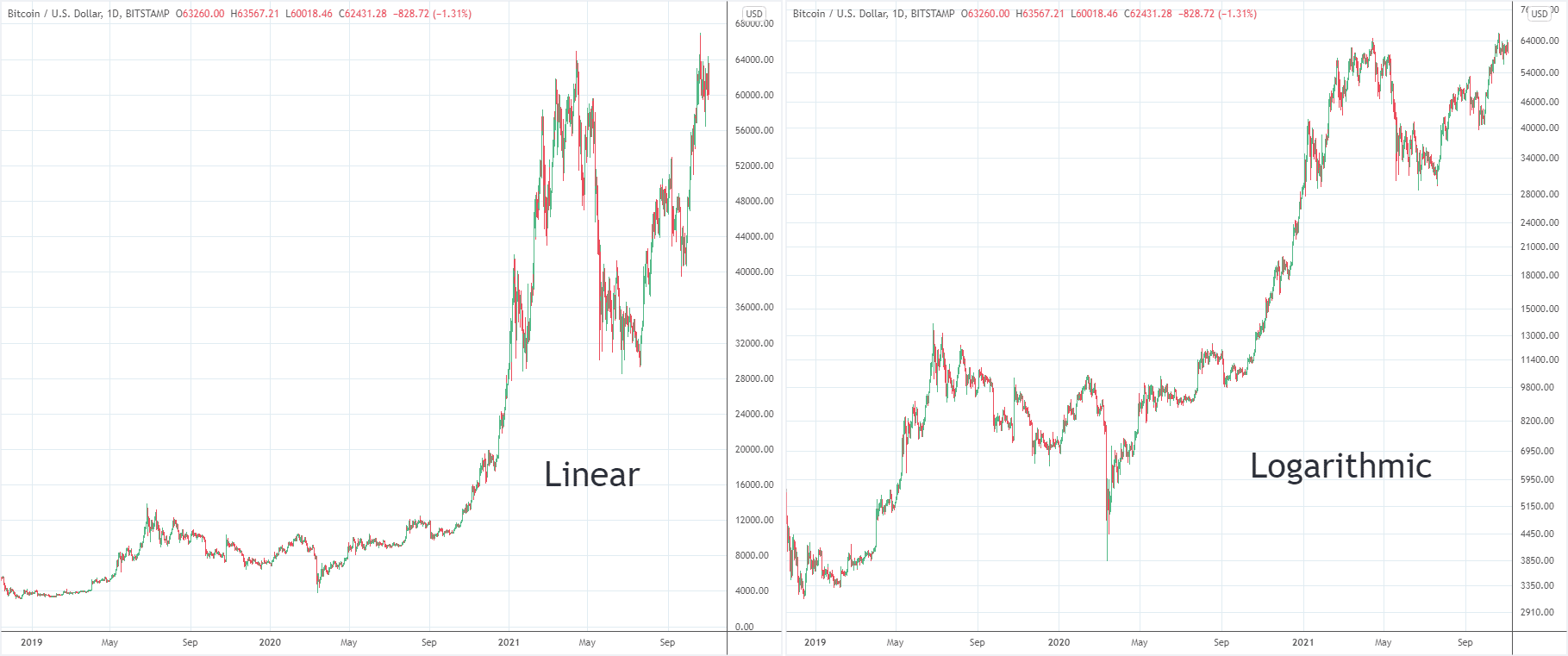
Logarithmic and linear scales are two important chart formats among various different charts formats. The interpretation of charts significantly varies among traders because of the use of the type of price scale when reading the charts. Both types of scales are offered by almost all trading platforms to view the charts. They look similar at first glance. However, there are key differences among logarithmic and linear scales. Let’s deep dive into the linear vs. logarithmic comparison!
What is a logarithmic scale?
Logarithmic scale or logarithmic price chart, also known as log, is a type of scaling that depends on percentage. Logarithmic price chart represents the vertical spacing, along the y-axis, between two price points while corresponding to the change between those points in terms of percentage.
In more simple words, a logarithmic price chart indicates price spacing on the vertical y-axis depending on the percentage of change of price of the underlying financial instrument. Logarithmic scale plots two equal price percentage changes at the same vertical distance. For example, the distance between $1 and $2 is equal to the distance between $2 and $4. Why so? Because both of these scenarios indicate a 100% increase in price.
Logarithmic price charts rely on the percentage change in the price and therefore, they are best for larger price fluctuations. They also enable you to identify and compare the extent of earlier and later booms in the price movements. Moreover, series that exponentially grow appear on a logarithmic scale as straight lines and are thus easy to identify.
What is a linear scale?
A linear price chart, also known as an arithmetic price chart, displays prices on the vertical y-axis. It uses equidistant spaces between the designated prices. That means, arithmetic price chart represents absolute values and displays changes in price levels with each unit change according to a constant unit value. Therefore, a linear price chart is the best option for smaller price fluctuations.
Linear vs. logarithmic price chart
“When should I use a log price chart and when should I use a linear price chart?” is one of the most common questions asked. Understanding when to use an arithmetic price chart and when to use a logarithmic price chart are the most important things when it comes to charts. If you don’t use the right scale, you can’t get the idea about price action. It leads you to make incorrect trading decisions that ultimately affect your trading output.
Linear charts are best when price are in a small range
In the financial markets, stocks trade for so many years, and their prices also rise over the long run. That means that the differences between the starting price of a stock and the highest price are usually high. For example, if Apple’s share price was $10 twenty years ago and its current price is $2,000, then you can see the difference is too big between $10 and $2,000.
So, when you plot prices on the arithmetic price chart, you cannot see the price movement when it was $10. So, you cannot get an accurate perspective about the price. Moreover, let us suppose again that Apple’s share price increased significantly recently and big green candles indicate the increased price. Given the recent rise in stock prices, anyone looking at a linear price chart might not understand it. However, looking at the same chart in the logarithmic price chart presents a totally different picture. Actually, it provides a totally different perspective.
In a nutshell, viewing a linear price chart doesn’t really provide an accurate price perspective when prices move significantly. Logarithmic or log price scale solves this problem.
Logarithmic charts are best for assets with wide range
The logarithmic price chart displays the price in percentage terms. That means it allocates price equally as a 100% move. So, it disregards absolute price movement. What does the actually logarithmic scale do? It represents the relative price fluctuation by comparing it to the previous price movements. Therefore, it gives a better long-term price perspective to viewers. That is the reason that log charts should be your obvious choice when viewing longer-term charts.
Conversely, short-term traders focus only on the short-term. They are only concerned with how much the price moves in absolute dollars terms. For example, they only observe prices increased from $10 to $15. They aren’t concerned about how much the price increased in percentage terms. Therefore, a linear or arithmetic price chart is the best for short-term traders. Percentage moves aren’t big enough anyway on a short-term chart to show percentage price movement.
Linear vs. logarithmic price chart – is it really important to choose one charting methodology?
As we have discussed earlier a logarithmic price chart is a type of scaling that shows price fluctuations in terms of percentage. On the other hand, the arithmetic price chart displays price fluctuations in absolute dollar terms. An arithmetic price chart or linear price chart is the best option when looking at a shorter time frame. Conversely, a logarithmic price chart is the best when looking at a longer timeframe.
However, how you look at charts isn’t the most important aspect of successful trading. After all, the data isn’t different for both types of charting, and price action is the price action. It is the price action analysis that matters the most. How traders analyze the price action separates successful traders from not-so-successful traders.
Moreover, the choice of whether to use a logarithmic price chart or arithmetic price chart depends on personal preferences and trading styles as well. Once you choose a charting method for yourself, stick with your choice, and learn how to identify signals in the best possible ways. Switching back and forth between different charting methodologies causes confusion and negatively impacts your analysis. You have to remember the fact that incorrect analysis is very rarely caused by charts. Therefore, try to improve your analysis before anything else.

 Good Trading requires the Best Charting Tool!

 We loved Marwood Research’s course “Candlestick Analysis For Professional Traders“. Do you want to follow a great video course and deep dive into 26 candlestick patterns (and compare their success rates)? Then make sure to check this course!