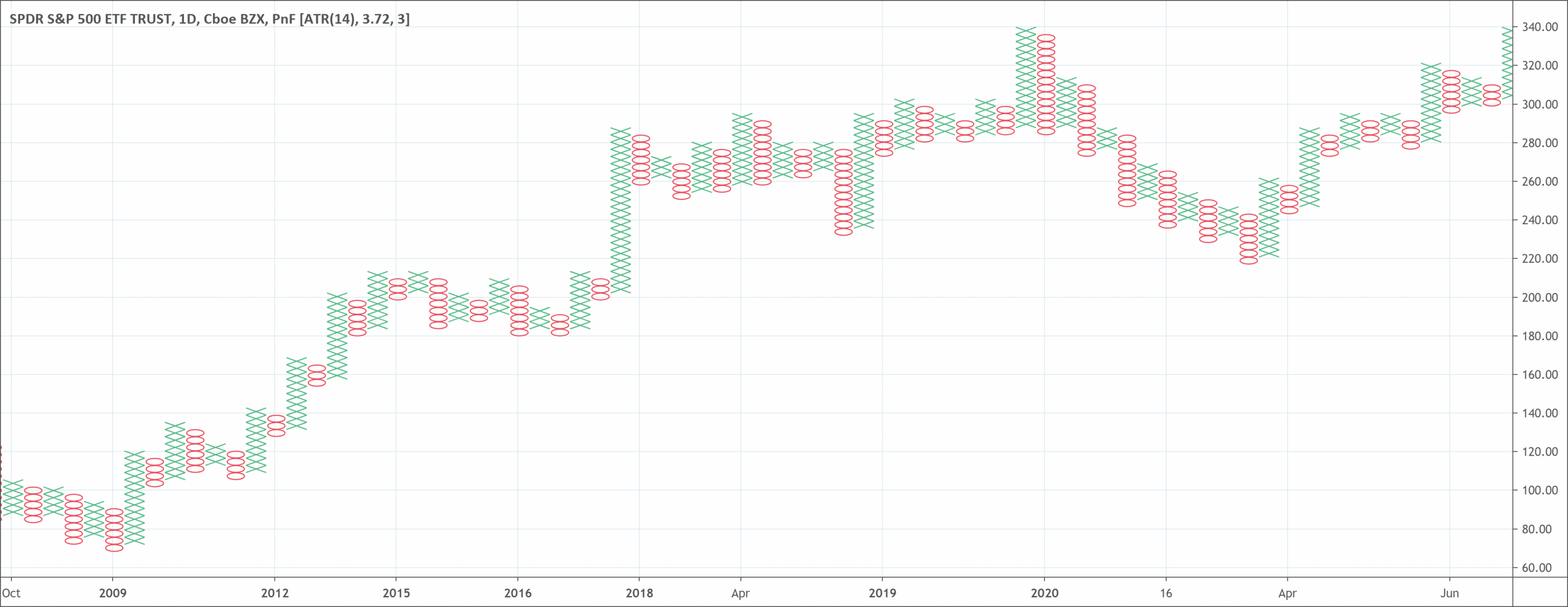
- If the price of an asset moves up by a certain amount, then it will form an X.
- If the price of an asset moves down by a certain amount, then it will form an O.
- Xs and Os stack on top of each other, and will often form a series of Xs or Os.
- The size of the box is determined by the price of the asset and the trader’s preference.
- If a column of Xs or Os is going to reverse, it has to go back by the amount it went forward.
What is the Point and Figure Chart?
A point and figure chart construct price movements for futures, bonds, commodities, or stocks without taking into account how time passes.
Some other chart types such as candlesticks mark the degree of the movement of an asset over a particular time. But P&F charts use columns made up of stacked Os or Xs, which represent a particular amount of price movement. The Xs show rising prices, while Os show falling prices.
History
Point and figure charts have been a part of the toolbox of many traders for over a century. In the late 19th century, Charles Dow made use of them, and Victor deVilliers published the first detailed explanation of this technique. He published it in his 1933 book titled “The Point & Figure Method of Anticipating Stock Price Movements.”
These charts track only changes in price and ignore time. Users of this method believe that focusing solely on price changes gets rid of daily noise in the market. Investors believe that by ignoring lesser movements, it should be simpler to detect huge resistance and support levels.
How to read the Point and Figure chart?
Created for long-term investment, point and figure (P&F) chart type are one of the simplest methods for determining good entry and exit points during trading. They monitor the supply and demand of every issue and keep an eye on new trends. What makes a P&F chart unique is that it does not account for the discrete passage of time.
Although this chart isn’t a favorite among most traders, there is a rising interest from all parts of the charting community. Chartists of point and figure chart suggest trading prices after a breakout by using the box count, either horizontally or vertically. But vertical projections often work best when compared to horizontal projections.
Traders still use concepts like resistance and support, and other chart types, when looking at P&F charts. Some believe that levels of support and resistance, and breakouts, are more clearly defined on a P&F chart. They think that because this chart filters tiny price movements and is less susceptible to false breakouts.
Support levels
This is a level where traders and investors alike believe prices will begin moving higher after hitting the support mark. When zeroing in on a trend reversal and an uptrend to begin, look for a horizontal row of O’s.
Resistance levels
A horizontal row of X shows the levels of resistance you need to be looking for in the P&F chart. Studies of trend lines have shown that a breakthrough resistance levels occurs with high energy, that is, with big volume and a rapidly increasing price of the commodity.
What does the Point and Figure chart tell traders?
Point and figure charts often offer technical analysts with various trend signals, connected to traditional bar charts. Although some traders heavily depend more on the point and figure charts, others use these charts to confirm signals given by traditional charts. This confirmation is to avoid false breakouts.
The secret to point and figure chart is the size of the box. Also the amount of price movement that determines whether a new O or X joins the chart. An example is if you have a box size of $3. If the last X occurred at $15, a new one joins the current column of Xs when the price increases to $18.
The line of Xs continues in the same column as long as the price keeps on rising and doesn’t breach a predetermined reversal amount. At that point, a new column of Os starts.
The same applies to a column of Os in a decreasing market. The column continues until the commodity gets to the reversal price. At that point, a new column of Xs starts.
A reversal happens when the price no longer moves enough to place another X or O in the current X or O column. Then the price moves at least three box sizes in the other direction. When a reversal happens, a lot of Xs or Os will appear at the same time.
Traders use P&F charts in similar ways to other chart types. Investors still watch for levels of support and resistance. Breakouts can indicate huge trend changes. Depending on the size of the box, the columns can show huge trends. When the column changes (from X to O, or O to X) that may indicate a major pullback or trend reversal.
Calculating the Point and Figure chart
Point and figure charts don’t need calculation, but traders will need to set at least two variables. One such variable is the box size, and the other is the reversal amount.
The box size can be a particular dollar amount, such as $1, a percentage, such as 5% of the recent price, or it can as a result of an average true range (ATR). This means that the box size will fluctuate based on volatility.
Traders also need to set the reversal amount. Typically, the reversal amount is three times the box size. For instance, if the box size is $1, the reversal amount will be $3. The reversal can be set at anything the trader wishes, such as one times the box size, or 5 times the box size.
An optional variable is if traders need to use low or high prices for the underlying asset or to make use of closing prices. Using high and low prices will mean the formation of more Os and Xs. Using only closing prices will mean lesser Os and Xs form.
Advantages of using it
Trends take a long time to reverse, traders should therefore, remember that P&F charting is for long-term investors. Also, it has no value whatsoever for the short-term trader.
By using point and figure charting to detect overall price trends, technical investors can take positions that have a strong probability of profiting. When using P&F charts, it is best to watch the actual price of the asset so that risk can have monitoring in real-time.
Limitations of using it
These charts can be slow to react to changes in price. A breakout, for instance, has to move the box amount to indicate that a breakout occurred. Some traders may find this beneficial, as it may lower false breakout signals. But the price has already moved the box amount beyond the breakout point. For some traders, receiving the signal after the price has already moved that much may not be beneficial.
Also, although P&F charts may assist in lowering the number of false breakouts, false breakouts still happen. What seems to be a breakout may still reverse a short time later.
P&F charts are great at keeping investors in strong trends, as a lot of small counter-trend movements get filtered. Yet when a reversal happens, it can erase profits significantly or lead to huge losses.
Since the reversal amount is large, if a trader is only using P&F charts it will be impossible to see the reversal. They can only see them when the price has moved against them.
The difference between Point and Figure and Renko charts
Renko charts also use box sizes. When the price moves by the box size it makes an up or down block that moves at a 45-degree angle to the previous block. Renko charts don’t have blocks or bricks next to each other. Thus, a reversal happens when the price moves in the opposite direction by two box amounts.
The major difference between the chart types is their appearance. P&F charts are side-by-side columns of Os and Xs. Various boxes spread out over time at 45-degree angles make the Renko charts.

 Good Trading requires the Best Charting Tool!

 We loved Marwood Research’s course “Candlestick Analysis For Professional Traders“. Do you want to follow a great video course and deep dive into 26 candlestick patterns (and compare their success rates)? Then make sure to check this course!